my Crafty Corner

Cards and other handicrafts made by Jean Straw

Saturday, 8 December 2012

Birthday Flowers


It seems ages since I posted anything here, ( well it is nearly a month actually ), I have been busy making Christmas cards and just haven't got round to the blogging. Anyway after just over a two week card making marathon they are all done and just need writing ready to post. I also have a load of family birthdays at this time too, three in November, four this week ,one next week and one more to do before the end of the month. Today I am showing you these two flowery cards that I made for my sister and sister in law for this week.
For this first one I stamped the rose from Chocolate Baroque onto white card and coloured it with colour soft pencils, and then trimmed it down and lightly shaded the background with spun sugar Distress Ink, and then mounted it onto some brown pearlised card.I cut some green pearlised card to fit the front of my base card and cut the scalloped edge with a Memory box die, and tied a pink organza ribbon around it before sticking to the card. I fixed the rose panel in place and then stamped and mounted the sentiment to match and fixed it place with foam pads.

For this one I started  in much the same way by stamping the poppy onto white card. This is also a Chocolate Baroque stamp as are the other stamps used on this card.The flowers were coloured with pencils and the background shaded with bundled sage DI, and mounted on a darker brown pearlised card. The base card is folded  from a light green pearlised card. I positioned the prepared image to left hand side and stamped the grasses and small butterflies at the side with Versafine olympia green ink. The larger butterfly was stamped, coloured and cut out and fixed on with silicon glue.

I am entering this at
 Crafty Bloggers Network- Anything Goes
Make It Monday- Anything Goes
Vintage Stamping Challenges- Pocket Full of Posies

 Thank you for taking a look, I appreciate your comments.


Sunday, 18 November 2012

Happy News

 Yes this this week we got the news we have been waiting eagerly for, the safe arrival of our first Great Garndchild, a beautiful little girl. This is the card that I made for her proud parents. I had nothing baby related in my stash except this backing paper from Papermania. It is actually from a set for making a little scrap book for a baby boy. As I didn't know if  was going to be a boy or girl at the time I chose this one because although it predominantly blue I thought the design was neutral enough for either. I cut it to fit the card with some scalloped scissors and  prepared two mounting mats one pink and one blue, so that the card was ready to assemble when needed. I then went to the craft show at the NEC  last weekend hoping to find a suitable stamp.This cute little baby snuggling up in a cloud  by Inkwell Stamps was all I could see.I stamped it onto white card and coloured it with pencils and used a Go Kreate scalloped oval die to cut it out. I shaded around the edge with Spun Sugar DI and added some white Flower Soft to make the
cloud look more fluffy. Next I glued the backing paper to the pink mount
and wrapped the pink gingham ribbon around it and added a bow. That was then fixed to the card and the stamped image fixed with foam tape. I stamped the words,( from an old clear stamp set I don't know the name of ) onto a scrap of patterned paper and again mounted it onto pink card and fixed to the card. Lastly I added two little heart shaped pearl buttons and a couple of charms. Finally here is a photo of the little lady at two and half days old, looking very fetching in her very pink girly dress.

I am entering this at Challenges 4 Everybody - Anything Goes
and at My Time To Craft - New Baby

Thank you for taking a look and for you kind comments, I really appreciate them.

Sunday, 4 November 2012

Christmas Robin

The Stampalot Challenge blog has changed it's name to Stamping Sensations and the  first challenge under the new name is for a Traditional Christmas card. I always like cards with robins on and having bought this lovely stamp form Chocolate Baroque I decided to try it out. I wanted to keep it fairly simple to see if it was viable for batch making. I'm not too sure about that though as it took me quite a while to colour it. I love the images of fairly realistic looking birds but worry about being able to colour them properly. However having stamped the image with Memento black ink I set to work with my colour soft pencils, I like using pencils as you can gradually build up the colour and it is easier to rectify any mistakes than when using pens. I used a paper stump and some Sansodor to blend the colours together. After also colouring the trees and ivy I used white liquid pearl and crystal ultra fine glitter to show the effect of the snow.the Christmas greeting is also from  CB and was stamped with a red ink pad.
I am also going to enter this at St. Luke's Charity Card Challenge where for their last challenge they too would like a Traditional Christmas card.

Thank you for taking a look and for your comments, they are much appreciated.    Jean 

Friday, 26 October 2012

Christmas Card Number One

Yes I am ashamed to say this is the first Christmas card that I have made this year in spite of my intentions to start earlier. So now as usual I will be rushing to get them all finished in time. The challenge this month at St. Luke's Charity Cards Challenge is for a CAS Christmas card, and I made up my mind to enter as it's ages since I have taken part, but here it is almost the end of the month again and I've only just about made it in time.
Here is the card I made, it is only small, about 4 x 4,5 inches, so not a lot of room for much white space, but the design is quite simple so I hope that it fits the challenge.I stamped the main image onto the card with Memento tuxedo black and onto some spare card with Memento rich cocoa. I coloured the trees with a green coloursoft pencil and the white distress marker.This turned out to be a bit tricky as the pen tip kept picking up the green and I had to keep cleaning it on a piece of kitchen paper. I was going to use a glue pen to add glitter to the snowy bits but my pen seems to have run out or dried up so I used white Liquid Pearls instead and some ultra fine crystal glitter. I stamped the star above the trees with Brilliance galaxy gold ink and embossed it with WOW clear gold highlights EP. I then cut out the little deer from the brown stamped image and used silicon glue to to stick him over the black one to give just a little dimension, and then stamped the greeting at the top. All the stamps used are from Chocolate  Baroque, the main image is from a set called Christmas Creatures, the star and greeting came from other sets.                                              
I am also going to enter this at Crafty Ann's- Christmas in October.
and Stampin' for the Weekend - Anything Goes.
Thank you for taking a look and for your comments, I really appreciate them all.  Jean.


Monday, 22 October 2012

U and V Alphatags

 Another month has passed so quick and it is time to show my tags for the Chocolate Baroque Alphatag Swap. We are nearing the end of our year long task and almost every one who started is still in, but with some very difficult letters all together at the end it doesn't get any easier to come up with ideas. Both of mine have a vintage feel to them this time which I didn't really plan but I struggled with finding stamps to match my ideas.

U is for Undergarments

For this one I covered my tag with some very pale pink backing paper from a Papermania pad and inked around the edge with Victorian Velvet distress ink.The background image is a crafty Individuals stamp, stamped straight onto the tag and coloured with pencils.The back dress form and the front stand were also stamped onto the tag,and the front dress
                                                form and all the corsets were stamped onto spare card and coloured with
 pencils and then cut out. I used an off cut from the backing paper to make a kind of pelmet at the top of the tag. I stamped the piece with a texture stamp and Victorian Velvet ink and used more of the same ink to shade around the edge. I used an edge punch to make a fancy edge along the bottom and then fixed it above the sign.I fixed a length of lace down each side tied with tiny ribbon bows to represent curtains and then fixed all the corsets in place, and added some little roses and a bit of ribbon for embellishment.The stamps are from Crafty Individuals and Chocolate Baroque, and all the main stamping was done with Memento Rich Cocoa ink.

V is for Victorian Valentine.

I took my inspiration for this one from the backing paper which is from crafty Individuals shades of Summer pad. It is full of lovely romantic images of roses and birds in pretty colours. I chose this one because I liked the birds and thought they looked just right for carrying a valentine greeting.The paper is 6x6 so wasn't quite long enough to cover the tag, so I found some matching braid and stuck it to the top to cover the gap and then added another piece at the bottom.I inked all the edges with Broken China distress ink. The large heart is a Chocolate Baroque stamp and was stamped onto the tag with Verasfine Majestic Blue which was really a bit too dark so I embossed it with WOW white pearl EP to tone it down a bit and also to give a nice lustre, which doesn't  really show in the photo. The top bird was cut out from the piece of paper left over from covering the tag and fixed using foam pads.The two tiny hearts are part of another CB stamp and were stamped onto spare card and embossed in the same way as the large one. I cut them out and fixed them to look as if the birds were carrying them as well as the flowers. I used a blue ink pad to add some colour to the roses from my stash and a little blue stickles  glitter and fixed them together with a piece of  lace to the bottom corner. The words were printed onto Saffmat using the computer, and some blue gems added for decoration.

Thank you for looking, your comments a re much appreciated.


Tuesday, 9 October 2012

Birthday Greetings

I need several cards for the men in my family during this and next month and I never find them too easy to do. However Chocolate Baroque have recently brought out a range of clear stamps to run alongside their excellent rubber ones, and when I saw this beautiful crane in the Oriental Crane set, I thought it would be ideal for some of them.
I first stamped the crane onto white card with Tuxedo Black memento ink and coloured it with colour soft pencils. I trimmed it down and used broken China distress ink to shade around the edges. I mounted it onto blue and then grey card and fixed it to a square white card blank. The grasses are from CB eastern grasses set and I stamped it once with memento London Fog and once with Versafine Olympian Green.
the greeting is stamped with the London Fog also.

I am entering this at The Stamp Man, Birds, Butterflies and Bees.
Make It Monday, Always Anything Goes.
Crafty Bloggers Network, Anything Goes.

Thank you for visiting, I really appreciate your comments.  Jean

Sunday, 23 September 2012

Alphatags S and T

It's time once again to show you this month's tags that I have made for the Chocolate Baroque Alphatag swap. The letters this month were S and T which were a lot easier than last month's.  I bought this Haberdashery set of stamps from CB some time ago and somehow haven't had the opportunity to use them and seeing as these scissors are so beautiful and begin with S, I decided begin with them and see where it led.

S is for Sissors, Sewing and Stitches.

I chose a background paper and covered my tag with it and then stamped the scissors with Memento Rich Cocoa and embossed with clear embossing powder. I coloured them with Sukura glitter pens  in gold and silver. The thimble was stamped, embossed and coloured in the same way and the cotton reels were stamped with the same ink but not embossed as I wanted to colour them with colour soft pencils. I used Victorian Velvet DI to add shading around the edges and then adhered the tape measure ribbon down one side. I pricked holes round the other edges using a Tim Holtz ruler and stitched through them to look like machine stitching. It reminded me of the sewing cards I used to do when I was a little girl. To finish off I added a little swatch of fabrics cut from a craft magazine freebie and fixed them in place by sewing on with the buttons and adding a small sewing needle making sure that the point was hidden in the tape and gluing some thread through the eye with a spot of glossy accents, and lastly hanging a pair of scissors charm with the ribbon in the eyelet.
I am entering this tag  for The Crafters Cafe Challenge, Stitching Faux or Real.


T is for Time and Tide

The tags that I bought some time ago are rather a dark cream, not really manilla which I think they were called, but I find that the colour of inks is somewhat distorted and I usually end up covering them with paper, but on this occasion I decided to try using Picket Post distress stain to lighten it .It worked quite well and created a nice matt almost chalky effect when I used DI to colour over it. I think I used Antique Linen and Tea Dye on the lighter side and Chipped China and Stormy Sky on the blue side. I added a little background interest on the right hand side by adding more Tea Dye ink through a Crafters Workshop stencil and on the left with a little stamp that gives the effect of ripples in the water.The main images were stamped with Memento London Fog and embossed with clear embossing powder. I coloured the flowers with colour soft pencils and the dandelion clock with picket post distress marker, and added the little clock face and gems. I decided that the ship didn't show up enough and stamped it again on spare card with Versafine Black Onyx, embossed it and cut it out and adhered it over the original and added a few highlights with the white marker pen.The wording was printed onto safmat on the computer and the individual words cut out closely and placed on the tag. I used Walnut Stain DI to darken around the edge. The ship stamp is from the Seashell Collage set from Chocolate  Baroque and the dandelions also from CB Punky Romance set.

Thank you for taking a look, I love reading your comments.

Wednesday, 19 September 2012

Dotty Oval

The Less Is More challenge this week is to use an Oval. I quite like ovals but I haven't got much oval stash, but I remembered this Stamping Up stamp that I bought last year.I stamped it with Versafine Crimson Red ink and then cut it out.The dotty edge on the stamp made me think of the Cuttlebug  Swiss Dots embossing folder and I used it to emboss the front of my card, and then wrapped a crimson ribbon around it.The sentiment is part of this months Craft Stamper freebie stamp which I stamped onto the sticky bit of a post it  and then cut away the words to form a mask. I placed this over the cut out label where I wanted the sentiment to go and stamped the words through the mask with Memento Rich Cocoa. The little birds are from a mini Artimo set That I bought last week because I thought they were so cute, and liked the fact that they facing different directions which will make them so useful.They were also stamped with the Rich Cocoa ink, the lower one was stamped straight onto the label but the top one I stamped onto spare card so that I could cut it out. This was very fiddly as they are very tiny, but I wanted to fix it to the top of the label, which I did with a spot of glossy accents, so that I could mount it over the ribbon with foam pads.
I am also going to enter this at Try It On Tuesday, Anything Goes
Thank you for taking a look, and for you comments, all very much appreciated.

Thursday, 13 September 2012

One Layer Foliage

Yes it is one layer at Less Is More this week and the theme is Foliage. This stamp from Lavinia Stamps came to mind straight away, it is one that I really like and I have used it a lot.I began by cutting  rectangle and circle masks with nestie dies. I taped the mask with the rectangle cut out onto my card and placed the one with the circle cut out inside it and inked it with Squeezed Lemonade  DI. I dried the ink and then covered it with the cut out circle and inked the rest of the background with Stormy Sky and a touch of Victorian Velvet.  I used Versafine inks in Spanish Moss and Olympian Green to stamp the acer branch, stamping the lighter one first and then masking it to stamp the darker one. The sentiment is from Crafty Individuals and stamped in the darker green ink.

I am also entering this at Challenges 4 Everybody, Anything Goes, and Make it Monday, Anything Goes.

Thank you for taking a look, I appreciate your comments.

Friday, 7 September 2012

Purple and Pink

This is a card that I made for my friend's birthday nearly two weeks ago. I only just got it made in time and thought I had posted it without taking a photo, but when I went to transfer some ATC photos onto the computer I found this, so I must have been having a senior moment and taken the picture without remembering.
I started to make this card knowing it had to be a pinky/purple colour scheme because they are my friends favourite colours. I decided to use this B Line Design stamp and inked it up with Onyx black Versafine ink onto a piece of ivory card. I then coloured it with colour soft pencils and very carefully cut it out . I used a Die Namics  die to cut the decorative oval frame from pale lilac pearlised card and stuck the image onto it. I chose a piece of purple patterned paper from my stash and cut a scalloped edge along the bottom with a memory box die. I did the same with a strip of the lilac card and layered them together.Next I took a folded A5 card and using a stamp from the Chocolate Baroque Texture Fragments set I created a background by stamping  randomly, firstly with dusty concord  and then picked raspberry distress Inks stamping off some of the ink onto scrap paper each time.Then I fixed the patterned panel to the card and added the oval mounted on some thin foam pads. I added a matching ribbon with a bow and then made the flower with circles of chiffon in two shades curled with a heat tool and fastened together with a brad.I didn't have a brad the right colour so I coated one with WOW Ruby Romance embossing powder. I added the flower to the card together with some silver leaves from my stash and some pearls also coloured to match. ( I used permanent markers for that ) I decided that the flower was really a bit bright so to balance it a bit I used two Memory Box dies to make the butterfly cutting the open one from card to match the oval frame and the solid one from bright patterned paper.
I am just about in time to enter this in Fashionable Stamping Challenges;Anything Floral/Handmade Flowers
and also Make It Monday; Always Anything Goes.

 Thank you for dropping by to look at my work, hope that you will like what you see and leave a comment. I appreciate them all. Jean

Saturday, 25 August 2012

Alphatags Again


Yes it's that time again, although I actually made these tags over a week ago but just haven't got around to doing the blog. As you will probably see I struggled somewhat this month with the letter Q,and though I had one or two ideas I ended up with Q for question mark, and even this hasn't turned out quite as I intended it to. However I do rather like the colours I used and I hope the person who receives it wont be too disappointed.The base tag was coloured with alcohol inks in Expresso,Terra Cotta and Willow with some gold added at the end with a Krylon pen. I then stamped some Chocolate Baroque swirly corners with versamark and embossed them with WOW gold fine detail embossing powder, and some curly Qs with brown Stazon ink.The question mark I drew by hand onto grunge paper and cut it out. I tried several methods of colouring it with various ink pads and stains but didn't like any of them and while searching for something else I found a jar of Viva Precious Metal Colour in Blue Lagoon that I had forgotten about and tried it out. It is a lovely colour and went well with my background so I went ahead and gave it two coats of paint. I still wasn't really happy with it so I ran it through the Cuttlebug with a Craft Concepts embossing folder, and then just touched up the ink a bit and edged it with the Krylon pen and attached it to the tag with foam pads. I also used the gold pen to edge the tag and the hole reinforcer.
                                     
    For R I went for Romance and Roses. I covered the tag with pink paper from an Artylicious Echoes of Italy pack, and again stamped the lovely swirly corner from the Chocolate Baroque nature swirls set, using Billiance Pearlescent Crimson ink.The Romance image is also a CB stamp from a set called Romantica, stamped I think with Adirondak Raisin and embossed with WOW pearl powder. I trimmed the bottom of the tag with a Fiskars edge punch and used the pearlescent crimson ink and a little dusty concord DI to shade round the edge. The roses and leaves are from my stash but were the wrong colour so I altered them a bit with some pearly paints from my Artquest Sparkling Pastelles pallet. The heart is one I made some time ago with a Das air drying clay in a silicon mould, and  I used several layers of ink and paint to get the colour I wanted. I finished the whole thing off with some ribbon and pearls and a piece of very pale pink lace through the hole.

I now have to set my thoughts to next months letters, S and T which should be a bit easier and then on to the really nasty ones!!. To be honest I have been lacking in inspiration lately, but I have been making some ATCs this week which I might show you later, so perhaps it is returning. Thank you all for dropping by, I love to hear from you.

Tuesday, 7 August 2012

Blue and Green


  This is the first time for a while that I have got round to entering the Less is More Challenge. This being the the first week of the month their theme is a colour one, namely Blue and Green, which I believe used to be a taboo combination but seems to be OK now. I think the modern shades make them more compatible.    
 I used a white square base card  and used post-it notes with a with a circle die cut from the centre to add an inky background.I used Distress Inks in Shabby Shutters and Bundled Sage. I then Stamped the Hero Arts image over the top with Broken China ink. I can't tell you whose the birthday greetings stamp is because it is a wood mounted stamp with no name on it.  I then just added a matching ribbon across the bottom.   I apologise  for this awful photo, it makes my card look really out of shape but I can assure you it is really square.
I will also enter this at Make it Monday, anything goes.
I'm sorry I haven't been around much lately I was without a computer for most of last week.It's back now with hopefully less gremlins to frustrate me and prevent me from visiting all of your blogs.
Thank you to all who look in and for your lovely comments. Jean  


Tuesday, 24 July 2012

Alphatags O and P


Time once again to show you my tags for the Chocolate Baroque Alphatag swap. The letters O and P were much easier for me this month as I am a literal thinker rather than a lateral one so I like doing the letters that easily lead the thoughts to a specific subject.


O is for Owl


It wasn't hard for me to choose owl because it gave me the chance to use this lovely Crafty Individuals stamp. I stamped him twice with black ink and coloured one image with coloursoft pencils and cut out the owl and his perch. The other one was coloured around the owl with distress inks, in antique linen and various browns, I'm not certain which ones now.The backing paper I found  in the bottom of one of my odds and ends boxes while looking for something else, and is the result of a long ago play session with some Starburst Stains. I don't think the shimmer shows on this photo but it is a coppery brown colour and had a textured look to it that I believe I had made with cling film. As soon as it caught my eye I thought tree trunk, perfect background for my owl.I cut a piece of this paper to make the tag and used a Tim Holtz wood grain embossing folder to add more texture.The leaves were cut from some patterned paper with a Sissix die and then I used some rub on coppery gold to enhance some of the leaves and fixed them to the tag with a large brad. Unfortunately I made a proper bish of it and had to start again which is why this one has a narrow border of card showing as my nice shimmery background paper wasn't quite big enough to cut another tag. The owl image was fixed to the tag with DS tape, the word owl was cut out from the second image and mounted to match the tag and fixed in place with foam pads. The coloured owl was mounted over the image with silicon glue and I also added some glue under some of the leaves to secure them.

P is for Poppy


Poppy wasn't first on my mind for P, but just when I was deciding, Chocolate Baroque released this lovely set of stamps called Pretty Poppies. My regular readers will know that I was singing the praises of this stamp set in my last post.
This is is the other main image in the set, there is also another flower stamp and some sentiments too. Anyway this time I decided to colour them differently and chose this mauve because every year I have lots of poppies this colour growing in my garden. They are only annual plants but I love them so much and they produce so many seeds that I just sprinkle them around all over the place, so that there will be plenty the following year. These were stamped with Memento black ink onto the tag and coloured with Distress Markers and a waterbrush. I then stamped again onto thin copy paper and cut out to make a mask to cover the poppies while I stamped my favourite Crafty Individual crackle background stamp randomly all over the tag with antique linen Distress ink.The shading round the edge was done with dusty concord. The letters were cut from mauve pearlised card using x-cut dies.
Now I am waiting to see what the postman delivers at the end of the month when the tags are swapped and sent out. You can see collage photos of all the tags so far here.

I am going to enter the poppy one at Penny Black and More @ Allsorts; Summer Blooms,
and at Make It Monday; anything Goes.

Thank you to every one who takes the time look and for your lovely comments.


Saturday, 21 July 2012

Sweet Summer Poppy

This lovely stamp is from one of the latest sets from Chocolate Baroque called Pretty Poppies which was simply tagged  "must have!!" as soon as I saw it. I love poppies of all sorts and colours although the red ones are my favourite so when I saw these I ordered them straight away and thanks to CBs  super fast service they arrived in time to make this card for my friends birthday. I started by stamping the image three times onto ivory card and once onto thin copy paper. I coloured one image completely with coloursoft pencils and then the two flower heads and butterfly on  another and just the front flower head on the last one. Next I cut out the image stamped on paper to make a mask to cover the poppy and stamped Crafty Individuals crackle background with Antique Linen DI. The two part coloured images were then cut out and layered on top with silicon glue to add some dimension. I cut a mount from gold mirri card and used a Memory box bistro label die to cut a gold label to carry the greeting. The red panel was cut to fit a square card leaving a border all round and then I used a Fiskars edge punch to decorate the left hand side. when all the layers had been stuck down I tied an ivory ribbon around and stamped the greeting on an offcut of background stamped card and cut it to fit the bistro label adding red brads for decoration in the holes and fixed it to the card using foam pads.
I am adding a couple of close ups to show the layers on the flowers. I didn't want to make it too chunky but just add a little dimension.

 I am going to enter this for The Stamp Man fortnightly Challenge,Anything Goes/ Summer Colours, and Make It Monday, Always Anything Goes.


Tuesday, 10 July 2012

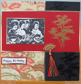
Taste of the Orient

The challenge at Fashionable Stamping Challenges at the moment is Oriental and as I haven't made anything
Oriental for a long while I decided to dig out some stamps and see what I could do. The image of the Japanese ladies is a wood mounted stamp by Just For Fun, which I stamped with black Archival ink and cut out close to the image and mounted onto gold mirri card. I covered the front of a square card with a piece of oriental style paper. I stamped the Acer branch  (Lavinia Stamps) with Versamark ink onto black card and embossed with clear EP. I cut a panel from this and stuck it to the right side of the card overlapping the patterned paper and inserting a strip of gold card to leave a thin border between.Next I stamped the Acer again onto red card and embossed with gold EP.  I cut this to fit across the card and again mounted it onto gold mirri card. I fixed the main image to this panel and added the little fan charm which was silver, so I used gold EP to make it the right colour, and tied some red and gold embroidery threads to make a tassel.The greeting was printed on the computer using an oriental style font.
I am also entering this at Make It Monday where as always Anything Goes.
Thank you to everyone who stops here to take a look and for all your encouraging comments.

Monday, 2 July 2012

Butterfly Wishes


It has been raining here all day and has been very grey and dismal looking, at not at all summery for the start of July. So I thought I would show you this card that I made for one of my sisters whose birthday was last week.It makes me wonder where the real butterflies go to keep their wings dry when it keeps raining so much.These two beauties are Chocolate Baroque stamps from a set called Patchwork Butterfly.I stamped them onto white card with Memento tuxedo black ink and coloured them with Coloursoft pencils, and then cut them out.The background paper is one that made some time ago with fresh flowers from the garden. I showed how in an earlier post here. I trimmed one edge with a scalloped cutter and mounted it onto some mauve card which I then fixed to a white square card. Next I stamped the butterflies again right onto the card and placed the coloured ones over them with thin foam pads.The greeting was stamped onto a scrap of the background paper and mounted to match, and I finished off with an organza ribbon.
I have added these close ups to show the colouring.
I am entering this at Make It Monday,    Always Anything Goes, and at
Dream Valley Challenges,  Anything With Wings.

Thank you for stopping by to look and for your comments they are really appreciated.


Tuesday, 26 June 2012

L M & N Alphatags


Once again it is time to show you the tags I have
made this month for the Alphatag swap that is taking place at Chocolate Baroque. The letters proved to be a bit of problem to some of us again this time, including me. N was the hardest for me , I had a couple of ideas but couldn't translate them to the tag as I had hoped.

L is for Let there be Light.

I started this one by colouring a tag with distress inks, but as it is a while since I  made it I can't remember which ones. I am sure Scattered Straw and Tea Dye are in there and I think I used Vintage Photo on the edges. I over stamped the left hand side with the large swirly corner stamps from the CB Nature Swirls set and versamark ink and embossed them with WOW ultra fine gold powder. On  a spare piece of card I stamped the candle from the Christmas Angel set and coloured it with coloursoft pencils and distress inks. I then trimmed it down and rounded the corners before fixing it to the tag. The words were computer generated, cut out and fixed beside the candle.


M is for Mistletoe.

Now I knew exactly what I was going to do for M because I recently bought this lovely stamp from Chocolate Baroque and haven't had a chance to use it yet although I'm sure it will be put to work when I get round to making Christmas cards. I started by stamping the Mistletoe with versafine Black Onyx ink onto a dark green tag and embossing it with clear EP. Next I stamped it again onto some white card and coloured with coloursoft pencils. I stamped the Mistletoe title on the bottom of the tag with versmark and embossed with gold EP. I then very carefully cut out the coloured mistletoe and glued to the tag with silicone glue.To finish it off I edged the tag with a gold Krylon pen.

N is for Night Time

For this one I coloured the tag with distress inks again, starting with Antique Linen for the moonlight and  adding Stormy Sky and Chipped Sapphire at the top and some Pine Needles at the bottom and then some Black Soot all around the edges and deepening the colour especially at the top. I stamped the dangley leaves from the CB Wisteria Lane set with the pine Needles ink and the other images were stamped with black ink and embossed with clear EP. The owls are from the nature Swirls set and the moon and grasses from the Home Sweet Home set.I die cut the poppy stems with a Memory Box die from thin black card and glued them to the edge of the tag to add some foreground interest. To finish I added some stars with Stickles  star dust glitter glue.

We  have now passed the halfway stage with our Alphatags and so far every one who started is still going, which is pretty good I reckon. One day I will do a blog to show you all the amazing tags I have received, they are making a wonderful collection.

Thank you to every one for stopping by to look at my work and for your kind comments, they are much appreciated.


Friday, 15 June 2012

Pussy Cat, Pussy Cat---

The theme for St Luke's Charity Card Challenge this month is Our Little Furry Friends. At first I thought "oh no," I don't have many furry animal stamps, but then I remembered this pretty Clarity stamp that I have had for ages. It was quite well used at one time but not for a while.
I started by stamping the cat on ivory card with Memento tuxedo black ink and adding a little colour with Derwent coloursoft pencils.
 I then trimmed it and mounted it onto some blue card.  The backing paper I used was a magazine freebie and I cut it to cover just over half the card and then fixed the image overlapping it.The printed flowers were part of the same freebie as the paper and I cut them out and layered them with blue flowers die cut from the same blue card as the mount and some little blue flowers from my stash all held together with a brad. I fixed them to the card with glue dots, tucking a piece of blue seam binding behind them.

I am also entering this at, The Craft Room Challenge; Furry, Four  Legged Family.

Thank you for stopping by, I love to read your comments.
Tuesday, 12 June 2012

Done With A Flourish

At Less is More this week we are required to make a one layer card with a flourish. I have made my card in neutral colours and without a sentiment so that it can be used for any purpose. I have found that these one layer clean and simple cards are ideal for almost any occasion and even make nice notelets to write a quick letter on.
Both of the stamps I used are Crafty Individuals and are stamped with
a three colour Brilliance ink pad called Tiramisu. That's it really, I just added a spot of gold Stickles glitter glue for a bit of glitz.I think you will be able to see it if you click on the picture to enlarge it.

I am also going to enter this at Truly Madly Crafty; Monochrome, and
The Hybrid Chick Card Caravan Challenge; Clean and Simple.

Thank you for popping by, I enjoy reading your comments.

Monday, 11 June 2012

A Little Bit Of Make-Believe

I do like a bit of make-believe now and again especially when it involves fairies, so when I saw that the challenge at Fashionable Stamping Challenges was Magical and Very Mystical I couldn't resist getting out my fairy stamps.                
 My design is inspired by the talented Tracey Dutton and all the stamps I've used are from her Lavinia Stamps range. I began by cutting a square of  ivory card and brayering it with squeezed lemonade Distress Ink.I then added more DIs around the edges in bundled sage, forest moss and gathered twigs. The stamping was done with Versafine inks in onyx black, olympia green and spanish moss. I stamped the tree trunk first and then the fairy door and the stone pathway. Next I added the leaves and foliage to soften the edges and some tiny toadstools at the front. I stamped the fairy positioning her so that she is sitting on the rather bumpy looking tree roots. I stamped her with black ink and embossed with black sparkle EP. I coloured her wings with Sakura sparkle gel pens and a water brush. Lastly I stamped the cluster of fairy dust with versamark and embossed with gold glitter EP. I added a little dusty concord DI to further define the edges and mounted it onto some gold mirri card leaving a very narrow border.The background paper is from a 6x6 Paper Cellar pad, Victorian Classics, trimmed to fit my square base card. I stamped the fairy script stamp down one edge and inked the edges with the dusty concord ink, and then  mounted the fairy image on top.I hope this will be magical enough for the challenge, and I am also entering at Stamptacular Sunday where the challenge is Fairy Fever.
 Thank you for coming to take a look, I love to read your comments and appreciate every one.

Wednesday, 6 June 2012

Hooray for the Red White and Blue

In tune with the Patriotic events happening this week the challenge at Less Is More is to use Red White and Blue in our cards. I decided to have a go although it is not my favourite colour combination.
I embossed the lower part of my white folded card using a Cuttlebug
Swiss Dots  embossing folder, and wrapped some red ribbon across just above the embossing. Next I took a piece of blue card and stamped the grasses from the Chocolate Baroque, Eastern Grasses set, with Versamark ink and embossed it with white embossing powder. I trimmed the edges of the image and used foam pads to  mount it on the card overlapping the ribbon and the embossed area. To finish I tied a bow onto the ribbon.I may add a sentiment later when I have decided what it will be used for.

There are several challenges with this theme this week so I am also entering this for,Moving Along With The Times;Red white and Blue,
Scrapbook Sisters Card Challenge; Red White and Blue, and also
Try It On Tuesday; Anything Goes.

Thank you to all who stop by to take a look and for your lovely comments.

Monday, 4 June 2012

Beside The Seaside

It was my brother in laws birthday this weekend and this is the card that I made for him.I wanted to use this beach hut stamp from Crafty Individuals, and I started by stamping it onto a spare piece of card. I coloured the huts  fairly loosely using distress inks and a water brush  as I wanted them to have a slightly shabby worn look .I highlighted the fascias with a white pigment pen.There are lots of the very similar ones to this along the beach fronts close to were we live, and I thought it would be fun to use them on his card.I used a paper from Crafty Individuals The Seaside paper book, choosing this one featuring a pier as we also have two of those on our stretch of coast. I cut it to size and stuck it to my card. There are some figures carrying surf boards on the paper too, but I thought they  were surplus to my needs and so I decided  that when I had cut out the beach huts  that's where they would go. The trouble is they then looked as if they were floating in the sea, so I  tore the shell border from another paper from the book and stuck it to the bottom of the card to ground them. I stamped two more shells onto the patterned paper and added a little more colour with coloursoft pencils and then glued them to the border with silicon glue.The greeting was also stamped on the same paper and cut out closely and edged with black ink and fixed to the corner. To finish off I stamped some seagulls from the same Crafty Individuals set with black ink and and used the white pen again to add some highlights.I had fun making this one and I think my brother in law enjoyed receiving it.
I am entering this at, Make It Monday; Anything Goes.
 DRS Designs Challenge;Signs of Summer
Simon Says Stamp; Anything Goes
Thank you for taking the time to take a look, and for your much appreciated kind comments.

Monday, 28 May 2012

A Day To Celebrate

This week my Daughter and Son in law are celebrating their silver wedding anniversary. I can't believe how fast the years have flown. They have two grown up children and are due to become grand parents later this year, which of course means that I will be a great grandma!! Scary!!! Anyway the reason I am telling you this is so that I can show you the card that I made for them. The base
card is a white linen effect A5 size. I used one of their wedding photos and cut the frame for it with a Die-namics Die from silver mirri card. The pretty patterned panel was chosen because it is roughly the same colour  that the bridesmaids dresses were. The across strip is from the same paper pad with the same design in negative. The acrylic label has Congratulations etched on it  which doesn't show up very well, so I inked it with a purple ink pad and the wiped it clean leaving the lettering coloured. I needed to do it a couple of times to achieve enough colour and it still doesn't show in the photo so I will put a close up of that bit. I threaded some white ribbon through the label and wrapped it around the negative patterned paper before sticking it to the card. Once all that was put together I used some creamy white roses from my stash and lightly coloured the edges of the petals with a lilac ink pad. I fixed them to the card with silicon glue tucking some silver Memory Box die cuts behind them. I then added a bow with the little silver heart charm hanging on it. I used silver peel offs for the greeting and added some pearls as finishing touch.

I am going to enter this for Make It Monday, Always Anything Goes.

Moving Along With The Times, Celebrate but no Birthday.

 Welcome to my newest followers and thank you to all who come by to take a look . I  love to read your generous comments.

Wednesday, 23 May 2012

Alphatags Again

Yes another month has gone and it's time to show you the tags I have made for the Alphatag swap at Chocolate Baroque. The letters this month are J and K. To me they belong together so I am happy that it has worked out that they come in the same
month. The reason is that I have a sister, Kate who is only 15 months younger than me and as children we were often dressed the same and people sometimes thought that we were twins, so it always seemed right to me that the first letters of our names are next to each other in the alphabet, and our birthdates although in different months are 17 and 18 too. However that is not telling you about my tags which in fact, although I liked the letters, were quite difficult to interpret, and I think some of my fellow taggers struggled a bit this time as well.


I decided on J for Joy but, how to show it? First I looked through my Graphicus Guild start up paper pack and found this one with bright yellow butterflies fluttering all over a background with shades of yellow and purple and I thought it looked pretty joyful. I over stamped it with  some Crafty Individual sentiments with joy in them and one from Chocolate Baroque, with a brown ink and then shaded the edges of the tag with dusty concord DI. The letters are from a bag of thin plywood  ones that I got in a stationary shop I think. I gave them a coat of white gesso  and then coloured them with  the dusty concord ink, and then using the same ink stamped them with a stamp from the texture Fragments set from CB. When they were dry I triple embossed them using Versamark  ink and clear embossing powder. I glued them to the tag with Glossy Accents, and then stamped the tiny butterflies from another CB set with brown ink onto different coloured parts of background paper scraps. I glued them on with silicone glue to raise their wings slightly.


I had a look through my Chocolate Baroque stamps to find something suitable for K and found this set which I think I bought in a sale and probably haven't used before, so I decided on K for Keys. I began by colouring the tag with tea dye and vintage photo distress inks and then over stamping the background pattern with the tea dye. The lovely ornate keys and escutcheon were stamped with black soot DI and embossed with WOW ultra fine clear embossing powder. I coloured them with a mixture of distress inks, coloured pencils and a gold gel pen.I used walnut stain DI to further define the edge of the tag and then found some metal keys in my stash to hang over the keyhole.

 They have been sent off now and I am eagerly waiting for the swaps to come. This swap is such fun and it great to see what ideas everyone else comes up with each time.

Thank you to all who come to look and leave me comments, I really appreciate them all.

Wednesday, 16 May 2012

One Layer Simplicity

The Less Is More challenge this week is to make a one layer card using three individual stamps. Both the Tall Trees and the Quote stamps that I chose to use  are from Chocolate Baroque and the flock of birds is a Clarity stamp. I also used three distress inkpads ( by coincidence ), Gathered Twigs, Bundled Sage and Forest moss. I used a water brush to draw out a little of the ink at the base of the trees just to ground them a bit.


I am also going to enter this for St. Luke's Charity Cards Challenge who want a one layer card this month too.


Thank you to every one who drops by to take a look and for all your lovely comments.

Tuesday, 8 May 2012

Mellow Yellow

There is a colour challenge at Less Is More this week and the colour is yellow. It's not a colour that I use very much in my stamping as a rule but this is what I came up with.
I used an old favourite Hero Arts stamp of a freesia and inked it  with wild honey and forest moss Distress Inks and stamped it to the right of my folded card.The sentiment is an Art Impression stamp which is also stamped with forest moss ink.  A very quick and easy card this week.    

I am also entering this at My Time To Craft; Happy Healing -  get well card.

Crafty Boots Challenges; Yellow.  

Thank you  for all your lovely comments each one is truly appreciated.                                      

Monday, 7 May 2012

A Visit To London

Here is a card that I made for a neighbour who was celebrating his 70th
birthday last week. I know that his main interest is rambling but as I haven't got any stamps for that and I know that he goes to London quite a lot,both for business and pleasure, I decided to use these stamps from Crafty Individuals. I stamped them with Onyx Black Versafine ink and embossed with clear embossing powder. I trimmed  them close to the image and added some colour with Distress inks. I think I used tea dye, bundled sage and stormy sky. I then mounted them onto white card leaving a small border all round them.I cut a red mat and mounted that also onto white with a narrow edge,  and then fixed to a navy blue card.
The images were then mounted with foam pads onto the red. A visit to London was stamped onto white card and cut out, edged with the black ink and fixed in the centre with pads.I wrapped three narrow ribbons across the lower part of the card and mounted the greeting over them. The greeting was computer generated and cut out with a nestability die, and then I drew round the outside edge of the die onto red card to create the mat and cut it out by hand.

I am entering this for Fashionable Stamping Challenges; Cities of the World.

Hello and welcome to my new followers, and thank you to every one who stops by to have a look, and for all your lovely comments, they are all appreciated.

Monday, 30 April 2012

Less Is More Sketch


The Challenge at Less Is More this week is to use one of these two sketches, leaving plenty of white space.

I must say that my entry this week is totally inspired by Mandies' card, I liked the way she has used just part of the flower stamp, something I have been trying to do lately to get more use from some of my stamps.So I started by stamping part of this Floral Spray from Chocolate Baroque with Versafine Olympia Green ink and colouring it with Colour Soft pencils. The card I used is very slightly textured and doesn't colour terribly well pencils, but when I had finished I used a paper stump and some Sansodor to blend the colours which helped a lot. I trimmed it to size and inked the edge with the Versafine ink. I mounted it onto the card slightly raised on foam pads and stamped the sentiment underneath again with the same ink. I am fairly pleased with the result although I would probably add some ribbon or some sort of bling by choice.

I am also entering this for, Make It Monday; Anything Goes.
Stamps And Fun; Use a Sketch from Another Current Challenge.

Thank you for all your lovely comments.


Wednesday, 25 April 2012

Charmed


It is a very long time since I entered a card  for Less Is More, not
because I didn't want to I just seem to be busy doing other things. Anyway  I noticed this week that their challenge was to make and/or use a charm and as I like adding charms to my cards and I needed a quick card for a friend I decided to have a go. I stamped the Hero Arts flower twice, inked with seedless preserves and forest moss Distress Inks onto white card. Then the quote which is from Chocolate Baroque was stamped with Memento Tuxedo black. I trimmed the card and mounted it onto some mauve pearl card. I then wrapped some narrow matching ribbon with a flower charm threaded on it around and fixed it all to a folded white card. A nice quick card to make and one that I was quite pleased with. Sorry to Chrissie and Mandie for being absent for so long, I will try and be back soon.

I am also entering this for The Craft Room Challenge; Ink It
and Make It Monday; Anything Goes.